When you hear the phrase “delightful UX,” what comes to mind? Do you picture a flourish of animation, or snarky copy? Illustrations of cute mascots, or aesthetically pleasing design? Delight has been stereotyped to superficial UI elements, and, while it incorporates these, in part, it also includes a number of attributes not typically thought of as delightful.
In this article, we aim to define user delight, differentiate between two types of delight: superficial and deep delight, and provide some insight to whether delight is worthy of pursuit.
Definition: User delight refers to any positive emotional affect that a user may have when interacting with a device or interface. User delight may not always be expressed outwardly, but can influence the behaviors and opinions formulated while using a website or application.
This definition seems relatively straightforward at face value, but, in practice, identifying delight can be complicated because often it is not expressed explicitly. While sometimes study participants may use phrases like, “I like this,” or “That was easy,” to indicate delight, they will not always vocalize enjoyable parts of an interaction when the interface works as expected. As a result, it can be challenging to quantify and study what truly makes a user experience delightful.
Even more confounding is the fact that a highly unsatisfactory or annoying experience may still result in recurring visits and repeat purchases — particularly in industries with loyalty programs and high costs of switching to an alternate company. Is generating delight a goal worthy of designers’ time and attention? To address that question, we must first understand the hierarchy of user needs and how it influences the user experience.
Hierarchy of User Needs
A famous theory that explains human motivation is Abraham Maslow’s hierarchy of needs, which was proposed in 1940. Maslow argued that people are first motivated by basic needs (such as food and shelter), and, as these are satisfied, they are able to progress and pursue higher-level needs such as love, self-esteem, and creativity. Foundational elements of human needs must be met before any higher motivations can influence behavior.
Aarron Walter, in his book Designing for Emotion, describes a hierarchy of user needs that closely mirrors Maslow’s hierarchy. He posits that superior needs (such as pleasure and delight — at the very top of the pyramid) can only be achieved after more foundational ones (such as functionality and usability) are fulfilled.
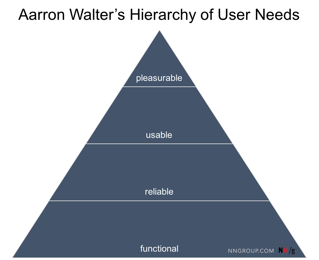
For example, a beautiful application that is not functional, (that is, it has no useful purpose) will not satisfy users’ basic needs. Because it lacks a function, its aesthetic qualities will remain unappreciated. Thus, even though it might be gorgeous in its own right, the user will probably not remember anything good about the experience. A product must first, before anything else, satisfy a need and be useful.
On the next level, a functional interface that doesn’t always work as expected is unreliable and will still leave users mostly unsatisfied, no matter how beautiful it is. Finally, the interface must be usable: it should not require much effort to learn, discover, and utilize all its features. Only when a product is functional, reliable, and usable can users appreciate the delightful, pleasurable, or enjoyable aspects of the experience. What Walter’s theory tells us, in short, is that a product can be delightful only if it is usable.
Surface & Deep Delight
Once a foundation of functionality, reliability, and usability are achieved, delight can be pursued.
There are two types of delight that users may experience when they interact with an interface: surface delight and deep delight.
1. Surface delight is local and contextual; it is usually derived from largely isolated interface features. For example, each of the following features may generate surface delight:
- Animations
- Tactile transitions or gestural commands
- Microcopy (i.e. injecting humor & slang, predicting users’ questions in advance)
- Beautiful, relevant high-resolution imagery
- Sound interactions

These types of UI elements are often gimmicky and have the potential for tackiness if the underlying product is less than perfect. However, when effective, these features can produce expressions of delight, and, as a result, have been the stereotype of delightful interfaces. But to say that delight stops here would be naïve at best.
2. Deep delight is holistic, and is achieved once all user needs are met, including functionality, reliability, usability, and pleasurability. Users may have a poor experience on a site, and yet feel surface delight occasionally. But deep delight only occurs when the user has reached a state of “flow” — that is, immersed productivity without much distraction from the main task. In other words, deep delight is experienced when the interface behaves like a surgeon’s knowledgeable assistant: it hands all the right instruments exactly when they are needed, without getting in the way.
This state of delight, while less impressive to witness, is significantly harder to achieve. Users who experience a state of deep delight will be more likely to recommend the product or service to a friend, and to become a passionate return user.
Deep delight can be best achieved with streamlined workflows and reduced pain points. It simply means building a product that works as expected (or better), and meets user needs at the right time and place. An exceptional user experience is a precondition of deep delight. While deep delight certainly isn’t as “sexy” as surface delight, establishing this foundation is the most important step to pursuing delight. If we attempt surface delight without first getting a good user experience established, we will lose return on investment (ROI) — we might invest time and resources toward features that won’t really make as much an impact.
It may seem that deep delight is like the holy grail — a good goal to have, but impossible to obtain. Are there any interfaces that actually achieve deep delight?
I am happy to report yes; however, examples are not exactly abundant. Below we discuss two sites which manage this performance.
Sites that Achieve Deep Delight
Yelp.com provides user reviews and other information about businesses and services.
- Functional: Yelp’s function is to help people choose a service by providing social proof — additional information offered by users of the same service.
- Reliable: Most of the time, Yelp is quick and responds as expected, consistently. Its content is effective in helping users make decisions and select the right business for them — proof being its more than 100 million visitors worldwide.
- Usable: Yelp delivers the right information at the exact time and place. Advanced options appear when the user hovers over a particular review or listing, or collapse when the user wants a map representation of businesses in the area. Most of the pages work seamlessly with few glitches or usability issues.
- Pleasurable: It provides appropriate, helpful, and sassy microcopy, subtle animations, and relevant images consistently throughout the website, making it feel personable, approachable, and fun.
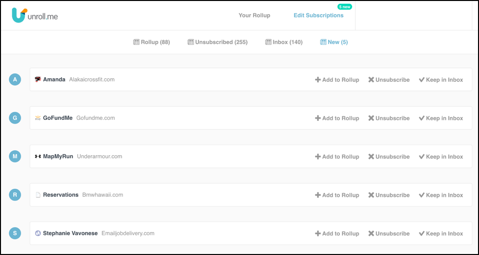
Unroll.me is an application which focuses on eliminating email-inbox clutter. For most of us, unsubscribing to an email newsletter involves an arduous vetting of email messages, typically scrolling to the bottom of each email, clicking through the Unsubscribe links (and subsequent pages). However, Unroll.me makes the process a lot simpler.
- Functional: Unroll.me helps users quickly manage their email-newsletter subscriptions: Unroll.me enables users to see a list of all email addresses from which they have received newsletters, and then select some to unsubscribe (“unroll”) from, others to keep in their inbox, and yet others to add to a daily “rollup” – a composite of the day’s email newsletters. Unroll.me decreases the time and effort required for reducing inbox clutter, and ultimately frees up space and mental effort for the user’s higher priority tasks.
- Reliable: Unroll.me works consistently and is effective in unsubscribing users to the email newsletters.
- Usable: The web app is simple, with few flashy design features and focuses on three primary functions: unsubscribe, add messages/addresses to a daily “roll-up,” (which enables easy consumption on users’ terms), and keeping important messages in the inbox. These are very clearly labeled, and new items have a distinct callout in order to draw attention.
- Pleasurable: There is ample feedback, a clean and professional aesthetic, and effective use of interface elements. Unroll.me provides relevant, personal, and encouraging microcopy at different stages of the process, and subtle animations help to reassure the user when tasks are completed.
While this site has very few elements of surface delight, the application is deeply delightful in its usefulness, reliability, and usability.
Prioritizing Delight
Due to their negativity bias, users remember the bad more than the good. If your product or service lacks basic functionality and reliability, delightful features will likely fail to provide any sustainable benefit to your user base. If your product has good usability, half the battle has been won.
Here are a few examples where the interfaces attempt to stoke a delightful reaction, but fall flat when usability issues are addressed:

Conclusion
Forced surface delight comes with potential branding risks. If, for example, a company is perceived by customers to be serious, formal, or traditional, attempts at humor, animation or other gimmicks may come off as non-genuine and potentially not trustworthy. To get any tangible payoff for prioritizing surface delight, design teams should question the side effects of this “pursuit of happiness,” and focus on the overall experience first. After all, no one’s ever said, “I’m thrilled this beautiful product doesn’t work as well as I expected.” If, by pursuing delight, the end goal of a functional, reliable, and usable product gets lost, it might be worth reevaluating design goals.